Website Wireframes Explained
In the tech-centric world of Freshly, where most of our team has been immersed in technology from a young age, we sometimes forget that what comes naturally to us may appear bewildering to our clients, leaving them feeling puzzled and lost. Enter our What The Tech? Blog Series, we've listened to your requests (and perhaps even witnessed a few tears, frustrations, and wishes to throw computers out windows), and we are here to respond with the kindness and empathy we have become known for. Over the upcoming weeks, we'll take the time to demystify the tools we use, share our favourite software, and clarify the technical jargon we casually toss around in conversation. Our aim is to help you gain a deeper understanding and navigate the tech landscape with ease. We hope you'll find these insights valuable and empowering!
first up - website wireframes!
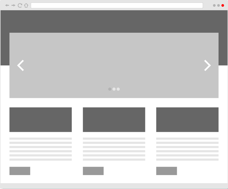
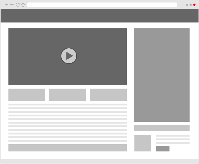
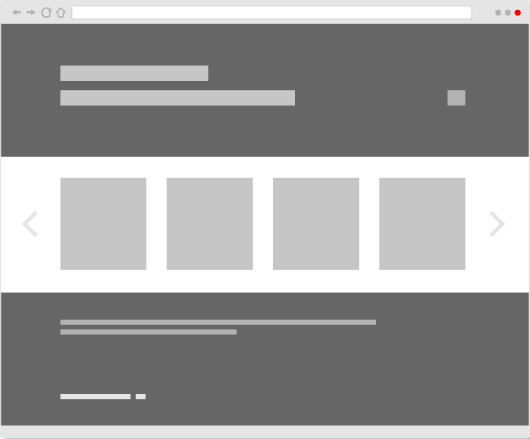
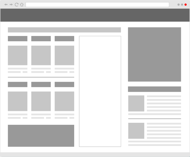
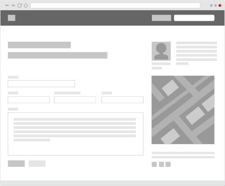
A website wireframe is a simple visual representation of a website's structure and layout. It serves as a skeletal framework that outlines the placement of various elements on the webpage, such as navigation menus, content sections, images, buttons, and other interactive components. Wireframes are typically black and white, without imagery and detailed design elements, focusing solely on the arrangement and hierarchy of information.
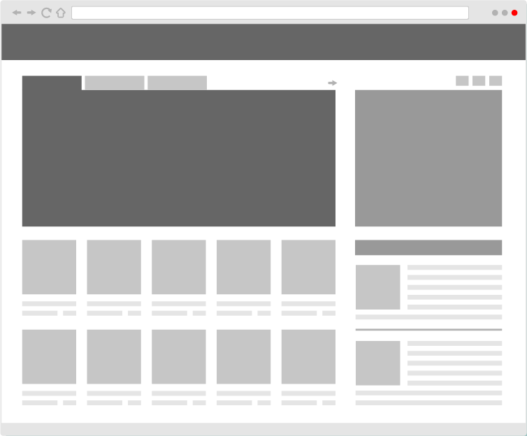
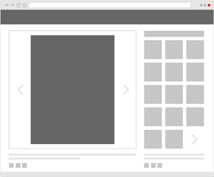
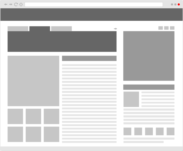
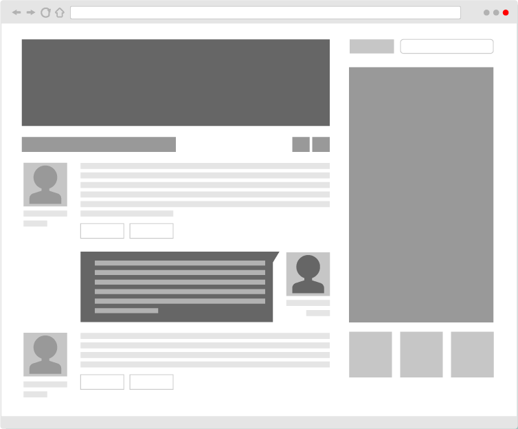
The main purpose of a website wireframe is to provide a clear and logical outline of the informational layout, ensuring that all essential elements are strategically positioned for optimal user experience and usability. It acts as a guide for designers, developers, and stakeholders involved in the website's creation, helping them understand the flow of content and functionality before delving into the visual design. Here are a few examples:
Here's how a website wireframe informs the informational layout:
Structural Organization: Wireframes define the overall structure of the website, showcasing the relationship between different pages, sections, and their respective content. This helps stakeholders visualize how users will navigate through the site and how information is grouped logically.
Content Placement: Wireframes indicate where various types of content will be located on each page. For instance, it clarifies the positioning of text, images, videos, calls-to-action, and other multimedia elements to ensure they are strategically placed to convey the intended message effectively.
User Flow: Wireframes illustrate the user flow or the path that visitors will follow while interacting with the website. This includes the navigation flow, indicating how users will access different pages and sections as they progress through the site.
Prioritization of Information: Through wireframes, the importance and priority of different content elements become evident. This helps in organizing information in a hierarchical manner, highlighting key points and minimizing distractions for users.
Functionality and Interactivity: Wireframes outline the placement and behaviour of interactive elements, such as buttons, forms, menus, and links. This ensures that the user interface is designed with user interactions in mind and that the website is intuitive to navigate.
Responsive Design: In modern web development, wireframes also consider responsive design principles, which means they show how the layout will adapt to different screen sizes and devices. This helps in creating a consistent user experience across various platforms.
While website wireframes are vital for shaping the informational architecture of a website, they do not dictate specific design details like colour schemes, fonts, or visual styling. Instead, they provide a solid foundation that guides designers during the subsequent visual design phase. By separating the structural planning from the aesthetic elements, wireframes allow for a greater focus on usability and functionality, ensuring that the final design is not only visually appealing but also user-friendly and efficient in conveying the intended information. You can see some examples at the bottom of this page!
If you would like more information about the wireframe we designed for you, please reach out to your Freshly team for help!
Stay tuned for more explainers coming soon!
Ashleigh @ Freshly Pressed


